Design Panel Elements
The design panel holds all the necessary tools for you to customize the layers of your artboards according to your needs. Although, many of the design elements discussed here are similar for every type of layer, there are some elements that are specific to specific type of layers.
You can read in detail about how to manipulate them in Manipulating Layers.
Alignment
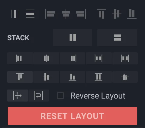
These options allow you to change the alignment of your Stack based on the layers grouped together.

- Distribute Layers Horizontally option takes layers that are grouped together and distributes them horizontally, with the parent layer on the leftmost side. This grouping is not bound by the artboard and may set itself beyond it.
-
Distribute Layers Vertically option takes layers that singular or are grouped together and distributes them vertically, with the parent layer on the topmost side. This grouping is not bound by the Parent Layer and may set itself beyond it.
-
Align Layers To The Left aligns all single or grouped layers to the leftmost side of the Parent Layer.
-
Align Layers To The Center aligns all single or grouped layers to the center of the Parent Layer.
-
Align Layers To The Right aligns all single or grouped layers to the rightmost side of the Parent Layer.
-
Align Layers To The Top aligns all single or grouped layers to the topmost side of the Parent Layer.
-
Align Layers To The Middle aligns all single or grouped layers to the middle of the Parent Layer with respect to height and width of the Parent Layer.
-
Align Layers To The Bottom aligns all single or grouped layers to the bottom side of the Parent Layer.
Stack
Stack options allow you to stack your layers one on the other either horizontally or vertically. Once stacked, you will see stack alignment options appear beneath the Stack option. These options change according to the orientation of stacking that you choose:
-
Align To The Top will align your stack to the topmost side of the grouped layer and stack other layers accordingly.
-
Align Layers To The Left will align the stacked layers to the left of the selection frame.
-
Align Layers To The Middle will align the stacked layers to the Middle of the selection frame.
-
Align Layers To The Right will align the stacked layers to the Right of the selection frame.
-
Distribute Layers To Stretch stretches the selected layers to the edges of the parent layer in a horizontal fashion.
-
Distribute Layers To Baseline aligns layers to a common baseline set by a child for its parent.
-
Align To The Center will align your stack to the center side of the grouped layer and stack other layers accordingly.
-
Align To The Bottom will align your stack to the bottom side of the grouped layer and stack other layers accordingly.
-
Distribution options will align your stack according to the option selected between the grouped layer and stack other layers accordingly. The options available are:
Distribution According to Space Between Layers
Distribution According to Space Around Layers.
-
Wrapping allows you to wrap certain layers within the artboard if they overflow. The two straightforward options available for wrapping are Wrap & No Wrap.
-
The Reverse Layout option reverses the selected layout and alignment options of your grouped layers. Note that the Stack Alignment options also reverse if you check this option.
- The Reset Layout button ungroups all grouped layers that are selected. It does not modify their allignment settings.
Layer Properties
The Axis Options allow you to position your layers pixel-perfectly. Just put in the values for the respective axis and that’s it. The options are:
X: X-Axis. Y: Y-Axis. W: Width. H: Height.
Responsive Design
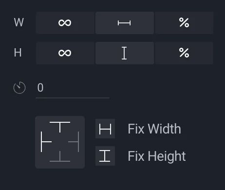
The Responsive Design controls allow you to create designs that will adapt to the screen that your app is viewed on and its orientation. This is only visible if you have a layer selected inside a group or Artboard.

Additional options for Width & Height include:
-
Setting to Fill, which fills the selected layer to the artboard and adapts to any change in the size of the artboard.
-
Setting to Fixed, which fixes the selected layer, irrespective of the change in size of the artboard.
-
Setting to Percentage, which sets the size of a layer to a specified percentage with respect to its parent layer.
-
Auto changes the height or the width of the wrapper according to its children components (in text, it removes the width and adjusts itself according to the text contained).
Below is a short video on how to utilize Responsive Design controls to their full extent.
Rotation:
The rotation option works on single as well as grouped layers. This option reads inputs in degrees, with a button to reset rotation to its original position.
Fixing Height & Width:
By default, the layers scale according to the size of the artboard and adapt as the artboard changes. You can prevent that by fixing edges of layers. To do that, click on the side that you want to fix in the graph and resize the artboard. The Fix Height & Fix Width options lock the width & height of the layer respectively. Note that at a time, two opposite sides on the graph or the respective width/height option can be selected. They cannot be selected together.
Up and Down in Text Fields
Once you are editing the text fields directly, You can use ↑ and ↓ arrows to change the value by 1 unit.
Clickable
Checking this box will make the selected layer clickable and helps add interactions between screens. An additional option will allow you to select which artboard should connect to the clickable layer. Just select the artboard name from the dropdown menu and the onPress function will redirect to that artboard.
Scrollable
Checking this box will make the selected layer scrollable and let you select the direction of scrolling, which could be horizontal & vertical. Double clicking on a scrollable layer or clicking on the Edit Content button will let you enter the scrollable layer in a separate screen and add or edit content that the layer will contain.
Styling
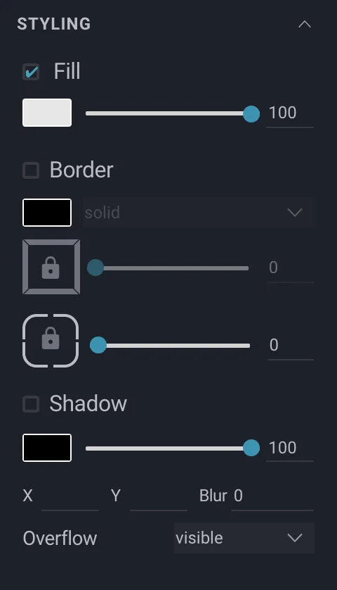
The styling menu displays options to change colours, add borders, margins and shadows to the selected layers. Checking each box will add that style to your layers.

You can hide each attribute by deselecting the visibility checkbox on its left.
Fill
Checking the Fill option will let you add colors to your layers. Clicking on the white box will take you to the color selection tool where you can either select a solid color, a linear or radial gradient or pick your own colours using the color picker tool.
Border
Checking the Border option will let you pick a solid, dotted or dashed border for your layer. The first graph with the lock icon at the center can be used to add a border to a specific side by selecting that side on the graph or select all of them by clicking the lock icon in the center. The slider next to it adjusts the thickness of the border.
The second graph adjusts the radius of the border and functions the same way as the border option.
Shadow
Checking the Shadow option creates a shadow of the layer. The intensity can be adjusted with the slider bar and the color by clicking the rectangular button. You can specify the projection of shadows by using values of X & Y as well as adding blur to it with the Blur option. You can also set the overflow of the shadow to be visible, hidden or scrollable.
Some other options with respect to specific layers can be found below:
Icons:
When an icon is selected, the Design Panel shows familiar options with some new ones. The Change Icon button allows you to replace the icon selected without changing its position on the artboard. The Styling option allows you to change the color, size as well as manage overflow for the icon.
Images:
Additional options for selected images on the artboard allow you to replace the image without changing its position on the artboard and gives you different resizing options such as Cover with the image, Stretch the image, Contain the image between constraints, Repeat images and Center align the image.
Shapes:
Additional options for selected shapes (Rectangle, Ellipse etc.) on the artboard allow you to Fill colours or gradients in the shape or change the Stroke of the shape and alter its width.
Artboards:
Artboards can be switched to the OS that you are building an app for through the Device option when an artboard is selected. The available choices are iOS, Android & Web with custom sizes and device selection. The Status Bar checkbox allows you to add a status bar to your artboard in dark or light content mode, as well as animate it to fade or slide.
Text:
When adding a text in your artboard, it is rendered as simple text in code. The Styling menu offers all basic text manipulation options. You can select the font family for your text in the first drop down menu under Styling. The second dropdown changes the font size & the third changes the font weight. You can also change the font colour by clicking on the rectangular button next to the dropdown menus.
Note: You can read more on these specific layers and how to perform operations on them under Special Operations.
Video Series
You can also check the video series covering different Layers in BuilderX.