Layout
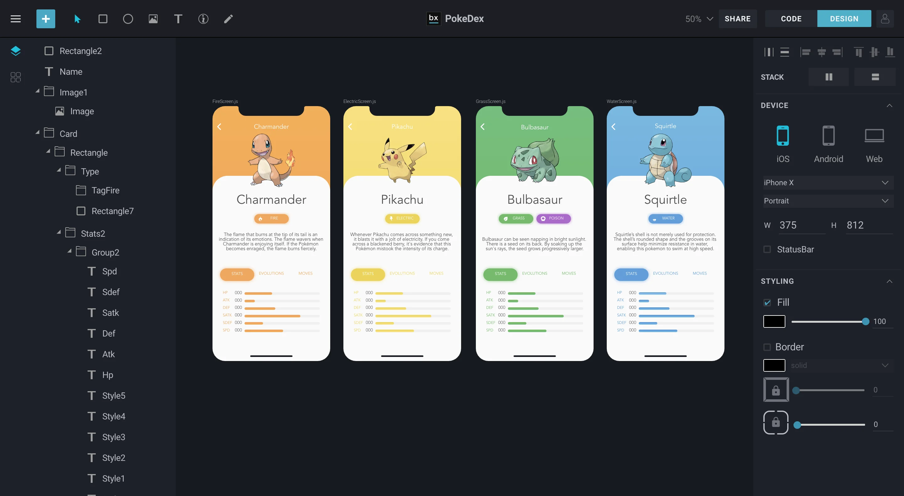
BuilderX has a clean and easy to understand interface.
You can consider the workspace to be divided into 5 major sections:

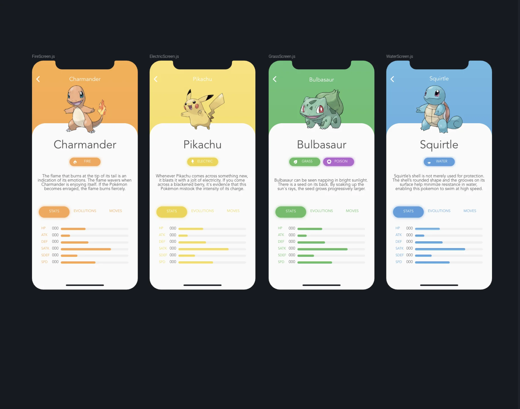
Canvas
The canvas is the first screen that you will see when you launch a new project in BuilderX. It is a
minimally designed space that will hold all the artboards designed by you.

The canvas is scrollable and can be zoomed in or zoomed out to enable you to see all your
artboards at once or focus on the little details in a single artboard by
pinching on the touchpad or using the keyboard shortcut command - plus(+)
(ctrl - plus(+) on Windows)
It also contains different screens based on the current context you are working in, such as the Main Scene where Artboards are shown, Component Scene or ScrollView Scene which triggers when you double click on a Component/Layer, which is explained further in the documentation.
Artboard
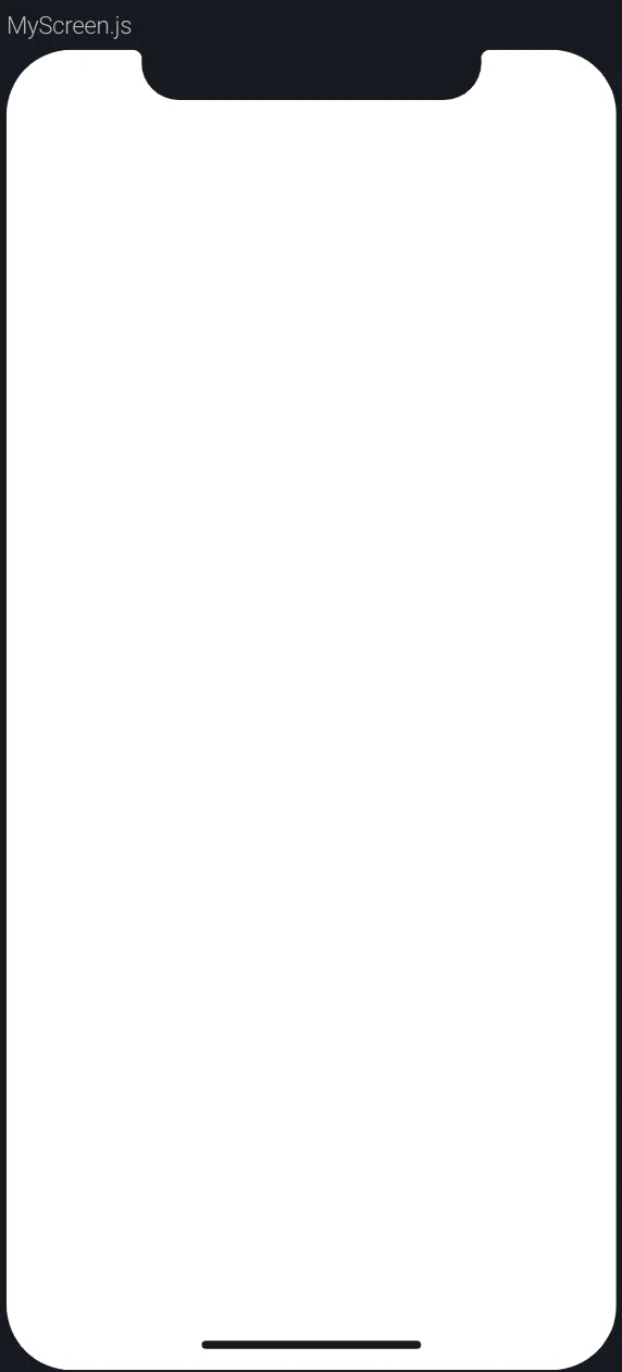
An Artboard is your creative space. They are empty screens on which you can draw, write, make shapes, add color and styles to create screens for your apps.

Adding Artboards
You can create multiple artboards on the same canvas by clicking the + button on the
top-left corner and clicking on Artboard from the drop down menu. Alternatively, you can
click the big + button next to the Artboard on the screen to create a new one.
Resizing Artboards
Artboards can be resized by single clicking the name of the artboard on the top left corner of the artboard and then dragging one of the corners. It shows the device that you have selected from the Right Panel.
Duplicating Artboards
Duplicating artboards is simple. Simply select the artboard, right click on the artboard anywhere and finally click on 'Duplicate Artboard'. This will create a replica of your existing artboard on the canvas.
Deleting Artboards
Unwanted artboards can also be deleted by simply selecting the artboard to be deleted, right clicking on the artboard and clicking on 'Delete Artboard'.
You can choose any device from the latest flagships with Android or iOS. BuilderX's Artboard will adopt the same design from the device specifications.
An Artboard in BuilderX corresponds to a Component, which is a particular screen or page of your application.
According to BuilderX defaults, .js files corresponding to Artboards are saved
in src/screens folder.
Design Panel
The Design Panel holds all the tools you need to stylize or design your screen on the
Artboard. The Design panel can be viewed on the right side of the screen by clicking on the
Design button on the top right corner of the screen.
Design options will appear automatically for a layer once the layer is selected. The Design Panel is explained in detail under Design Panel Elements.
The Layer & Components Panel
The Layer & Components Panel can be found on the left side of the screen. This bar contains a list of
all components applied or used in your project, as well as a list of all pre-made components that can be
dragged and dropped into your Artboard.
The different parts of The Component Panel are explained under Layers & Components Panel Elements.
Toolbar Panel
The Toolbar panel contains generic and basic components that will help you navigate and draw on your artboards. This panel can be found on the top side of the screen and contains the name of your project in the center.
The different parts of the Toolbar Panel are explained under Toolbar Panel Elements.
Code Viewer
This is where the real magic is. This is where all your designs are converted into React & React Native code. Code Viewer is useful for developers as it lets you to check the generated code directly.
The Code Viewer can be toggled by clicking on the CODE button on the top-right corner. You
can select artboards and see as well as use the code or select individual components and view, as well as,
download them as code.
The small gear next to the Download Code button presents a checkbox list which features Smart Flex. The Smart Flex algorithm of BuilderX automatically modifies your code to present all layers and components in minimal & most optimised fashion, thus generating beautiful code.